2017
LES MOTS - Igniting self-expression
This unique approach to teaching writing raised interest from the start. 60% of the courses were booked in less than 3 weeks after opening. LES MOTS is now established in it’s singularity having expanded it’s program to include a wider variety of courses and events. Since it’s debut in jan 2016 it received increased interest. This is shown by the growing number of people enrolled with each new semester as well as registered users and overall websites visits.
Telling the story
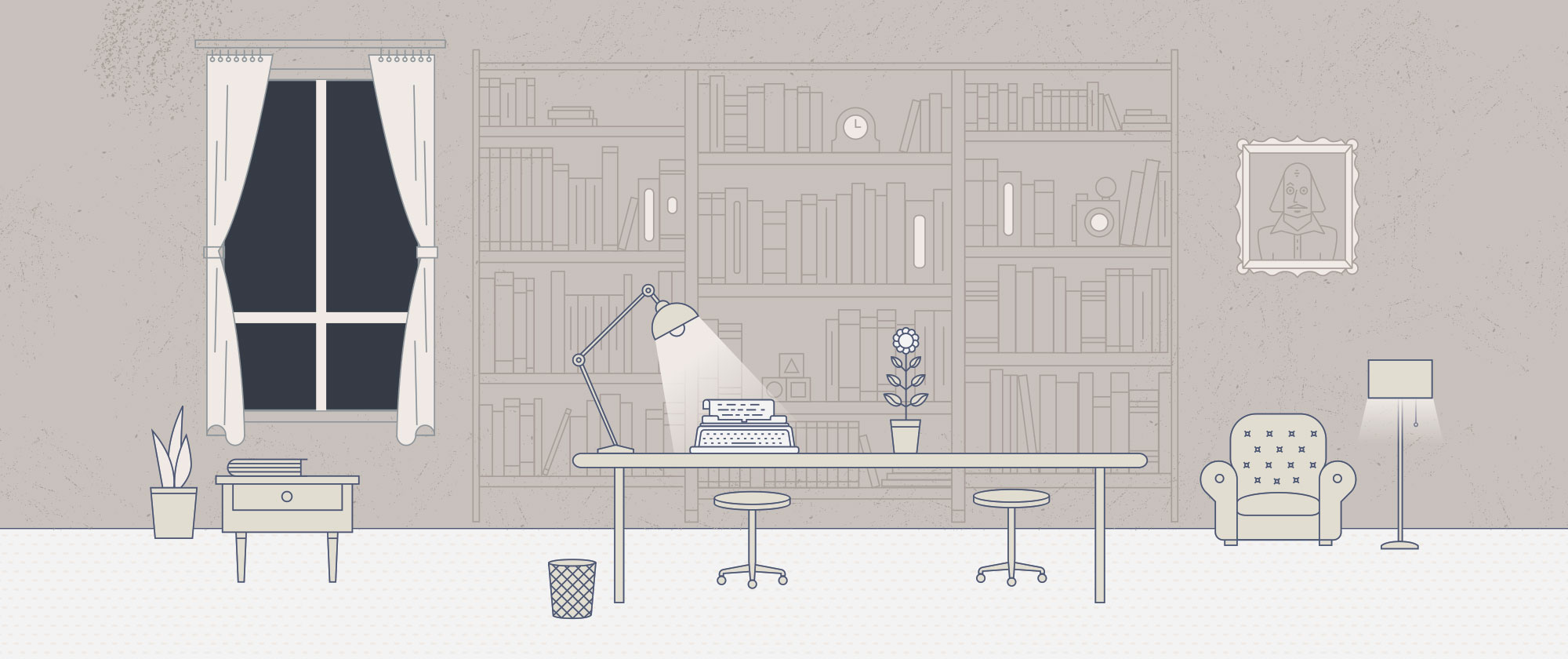
When my help was solicited on the project it felt like a thrilling challenge. Working closely with the founders we shaped the story of a writing school that didn’t yet exist. Next, we launched a website to present the concept and to enquire visitors about their interest in a project as such. For this purpose, I produced a number of illustrations to complement the story and set the ambient. These were used on the website and in a strategic PDF presentation of the project.
We shortly discovered that many people loved the concept and were eager to engage. Their motivations were varied and knowing about them helped further inform the strategy and the design.
Branding
The aesthetic of the logo was mainly inspired by the name: LES MOTS. Its commonness had to be played to its advantage and I found appropriate to have it written in uppercase such that it further emphasizes the importance of words as pillars of human communication. The space between the letters it is meant to evoke openness, one of the core values of the school. The logotype also has a subtle resemblance with the typographic style used in chapter titles of Victorian age books; hopefully marking the beginning of a new chapter in the life of anyone who takes on writing.
The challenge was eventually met. The resulting identity looks modern, elegant and has great versatility standing out in large and small sizes.
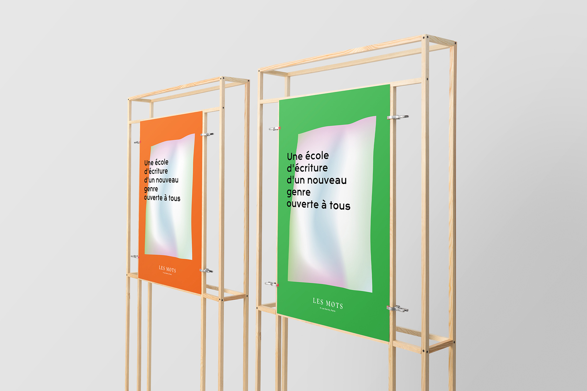
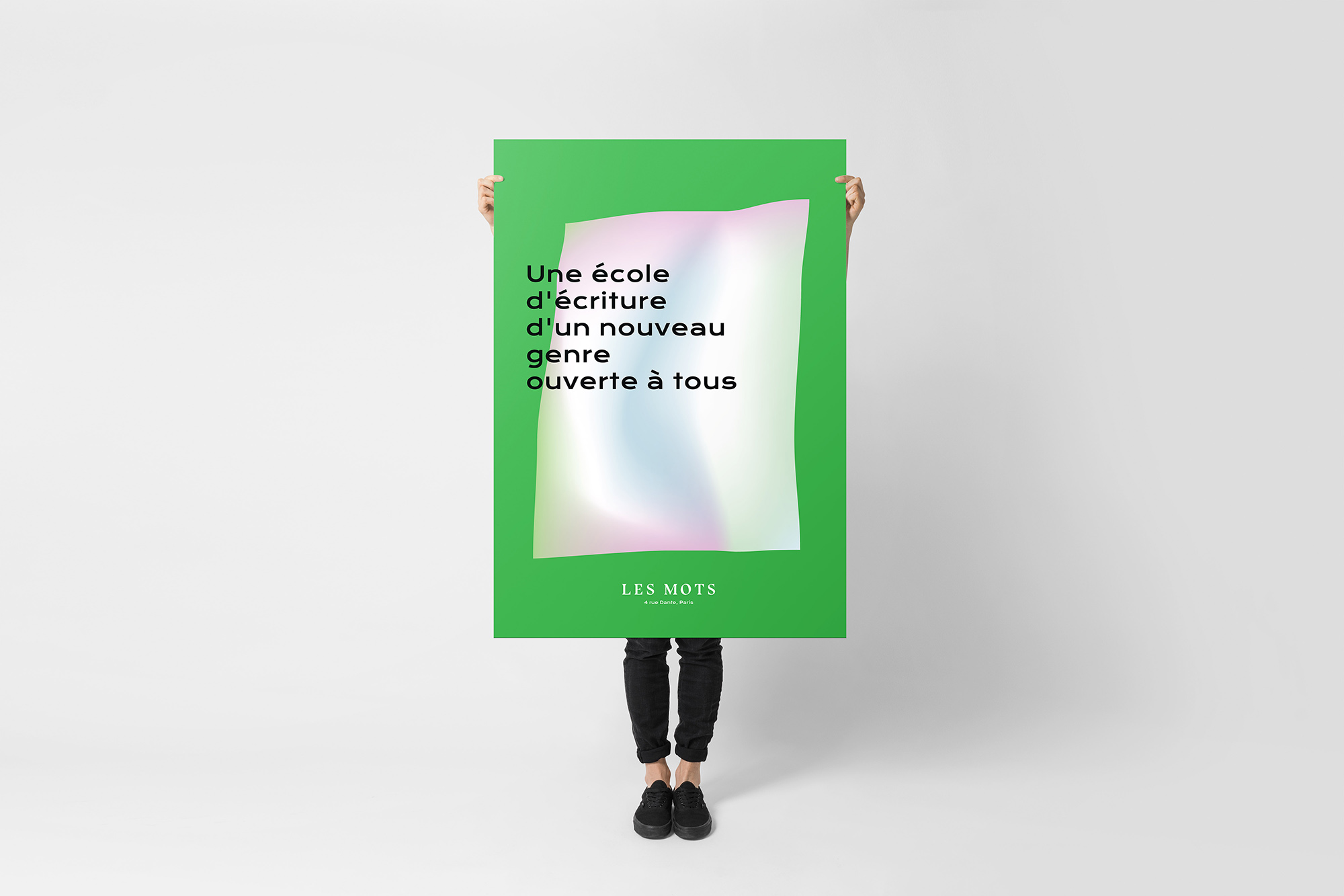
Poster
Creative direction
The online platform
Before LES MOTS opened its doors it was essential to create a website that would reflect the unique nature of the school and let visitors discover and inscribe on courses.
To achieve that I have designed a general coherent online experience by addressing these 3 challenges:
To effectively communicate the concept along with the people involved and their roles. To present the commercial offer in a structured manner so that visitors quickly discover the courses that interest them. To give a hint at the benefits of joining LES MOTS by featuring regular events and content produced by enrolled students in courses
J'ai rencontré Marius au NUMA lorsque j'ai commencé à travailler sur ce qui allait devenir “Les Mots” début 2016. Il très fin et novateur dans sa vision du design. Ses illustrations m'ont beaucoup séduites. Pour moi, c'est un authentique artiste-designer. C'est exactement ce que je cherchais, moi qui crois en l'alliance des talents, des images & des mots qui se répondent et s'épaulent. Je cherchais une personne sensible avec une vraie identité artistique. Marius a été force de proposition et nos échanges nourrissaient aussi, ma propre vision du projet. Les Mots ne pourrait exister si Marius n'avait été là. Elise Nebout CEO and co-founder LES Mots