Buttons using composing and inheritance
Let me show you briefly how I made buttons with inherited properties in Figma. I choose buttons for this example because a simple button is made of only 2 elements: a rectangle and text.
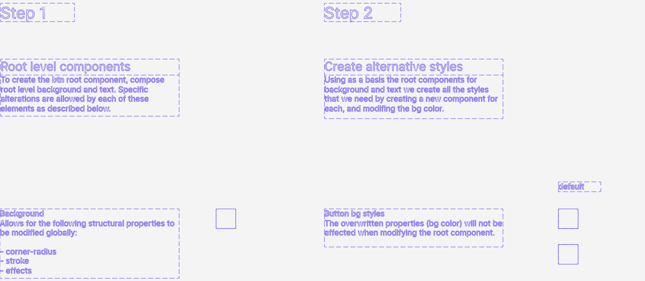
Let’s begin by making a rectangle and a text in figma. Now make each into a component, bring them together to form a button, select them both and turn it into yet another component, rename them all as follows:
So far you should have 3 components such as:
btn__bg > rectanglebtn-txt > textbtn > btn__bg, btn-txt
These are the root components and changing any property that is not subsequently overwritten will propagate to all components containing them.
To keep things simple let’s make 2 separate style buttons. Keep in mind that each will have hover and active states which makes 6 buttons in total.
Now, take btn__bg duplicate it 6 times and make each a component again and rename each of it like this:
btn.green__bg > btn__bg > rectanglebtn.green_hover__bg > btn__bg > rectanglebtn.green_active__bg > btn__bg > rectanglebtn.yellow__bg > btn__bg > rectanglebtn.yellow_hover__bg > btn__bg > rectanglebtn.yellow_active__bg > btn__bg > rectangle
Next, we’re gonna create the button text styles just as we did for backgrounds. 2 text styles suffice, so let’s make one dark and one white, and rename them as follows:
btn-txt__white > btn-txt > textbtn-txt__dark > btn-txt > text
At this point you maybe ask yourself what are we gonna do with all these components. Let’s take btn which is our root component and duplicate it 6 times as we did with btn__bg making each into a new component and renaming it as follows:
btn.green > btn > btn__bg, btn-txtbtn.green_hover > btn > btn__bg, btn-txtbtn.green_active > btn > btn__bg, btn-txtbtn.yellow > btn > btn__bg, btn-txtbtn.yellow_hover > btn > btn__bg, btn-txtbtn.yellow_active > btn > btn__bg, btn-txt
So far so good, what we need to do next is to swap the components within btn, the second level component, with the ones we have created for background and text style. This results in something like :
btn.green > btn > btn.green__bg, btn-txt__darkbtn.green_hover > btn > btn.green_hover__bg, btn-txt__whitebtn.greena_active > btn > btn.green_active__bg, btn-txt__whitebtn.yellow > btn > btn.yellow__bg, btn-txt__darkbtn.yellow_hover > btn > btn.yellow_hover__bg, btn-txt__whitebtn.yellow_active > btn > btn.yellow_active__bg, btn-txt__white
Ok, I realize this post is starting to look a bit odd but hold tight! Naming is important and we’re almost done. In order to have everything work as intended all constraints on all nested elements should be set to the top & left right & bottom. And that’s pretty much it. Now when you want to change border radius for all your buttons (regardless of style) you just have to change it once on btn__bg root component. Same for texts. here’s a link to the working file.